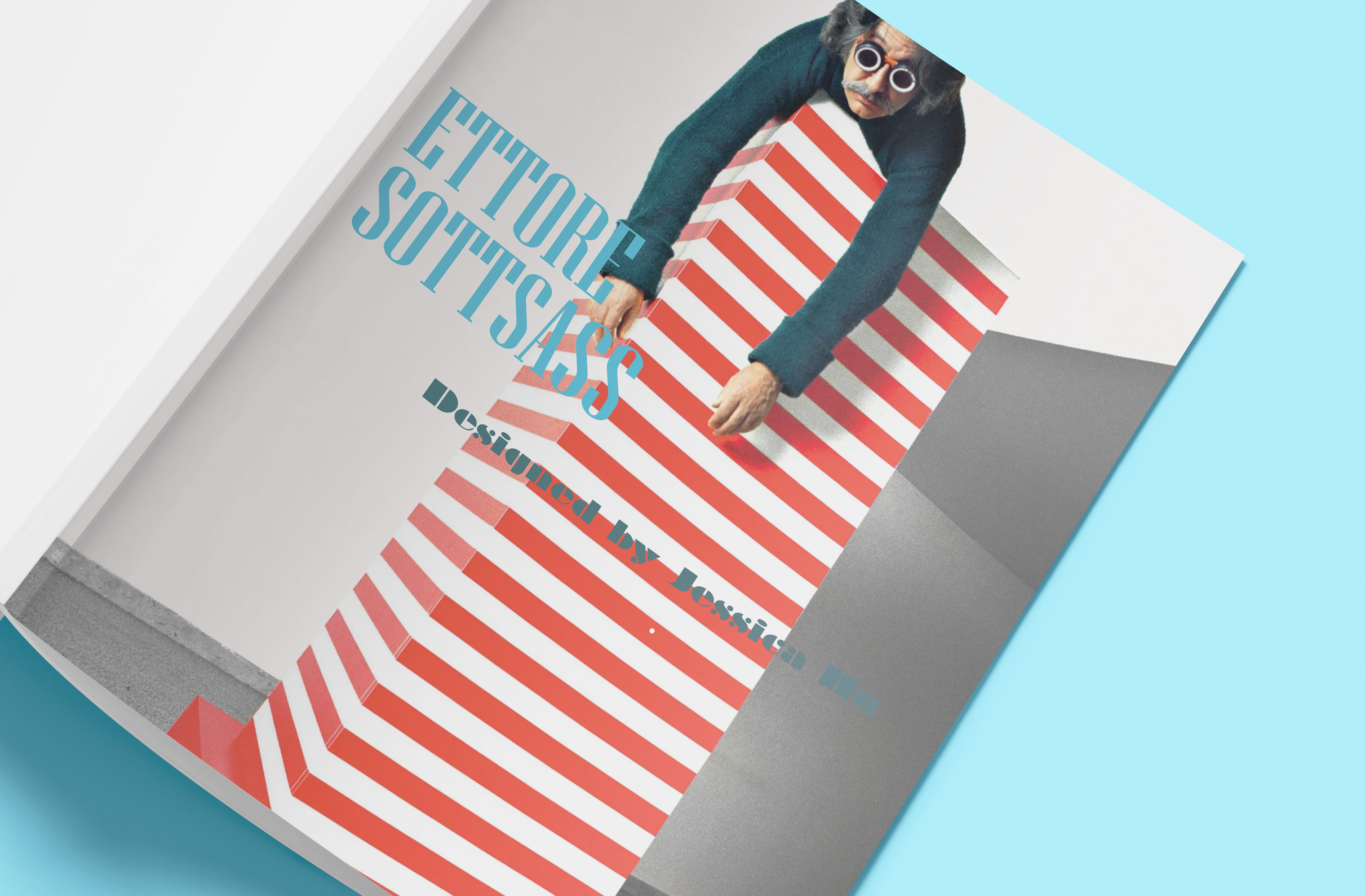
A book about Memphis designer, Ettore Sottsass's, designs and life. The book's art direction complement the photographs of Sottsass's industrial designs within it.
Design Approach
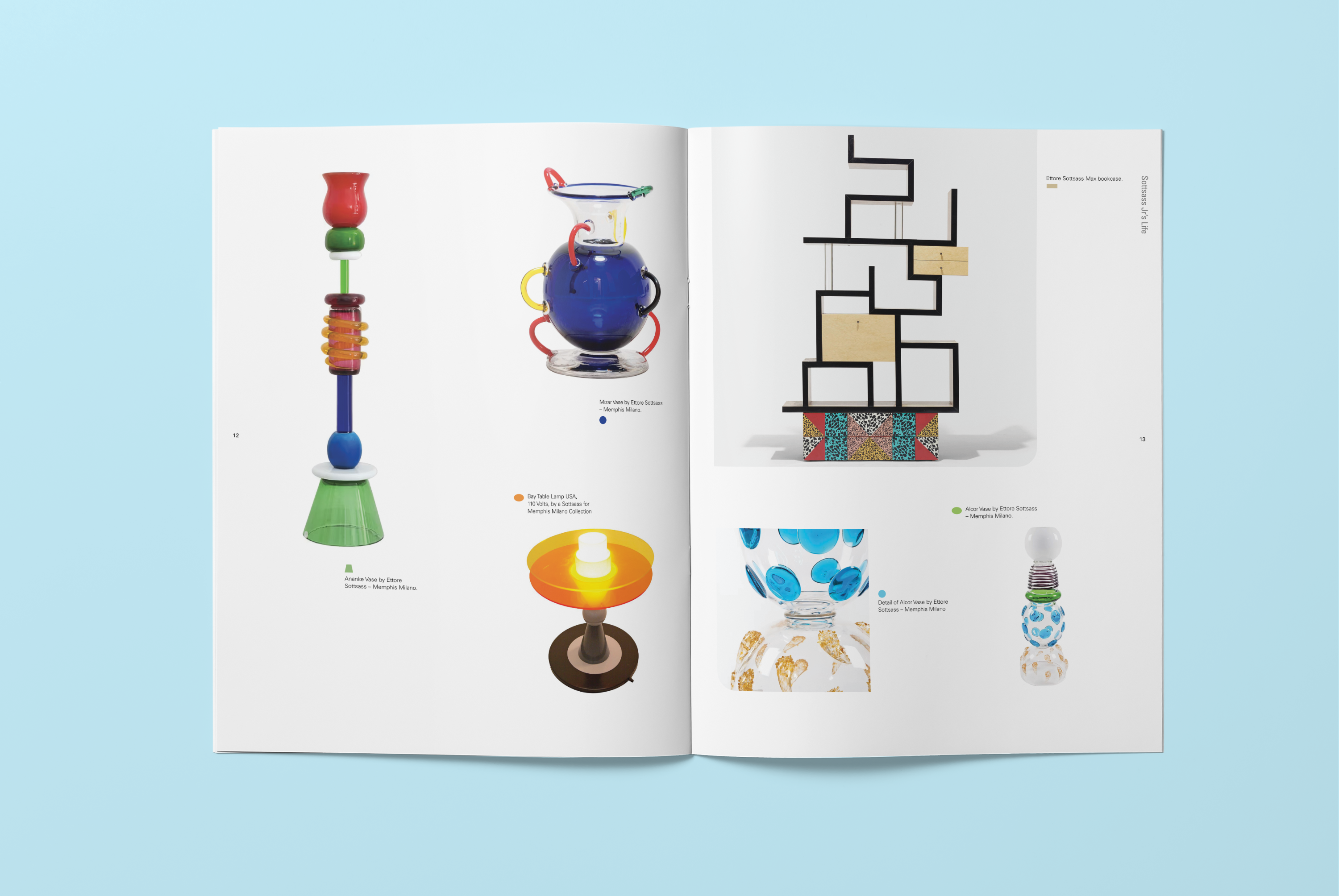
As Ettore Sottass founded Memphis design, it was important for the publication's art direction to complement the Memphis's playful attitude, bold, clashing colors and geometric shapes. So, colored geometric shapes anchor the captions for each image, and one corner of each image is rounded to playfully reference the shapes in Memphis design. Display typefaces that emulated Memphis designers' sense of shape were also chosen and contrasted them against each other. A typeface that was wider with a tall x-height (Braggadocio), against a taller typeface with a smaller set width (Niagara), in all caps.
Book Spreads