The Ventra App is an existing public transportation app developed by the Chicago Transit Authority (CTA). It has a large Chicagoan user base, and is made to help users navigate around Chicagoland with the public transportation available, including CTA buses and trains, Pace buses, Metra trains and Divvy bikes.
This Ventra App case study tackles two areas of opportunity: the home screen, and the map navigation flow.
Existing Functions
Right now, the app is capable can help users manage balances and passes, and aid them in navigating around Chicagoland. A breakdown of the specific features are below:
To help users manage balance and passes, the Ventra App allows users to:
- View balance and passes.
- Load balance and purchase passes.
- Automatically adds value to a user’s Ventra card.
- Be notified to load balance and purchase passes.
To help users navigate around Chicagoland, the Ventra App allows users to:
- View nearby transportation options.
- Search transportation options around a specific location.
- See arrival and departure information.
- Provide directions from one place to another.
- Add favorite locations and stops.
Problems and User Feedback
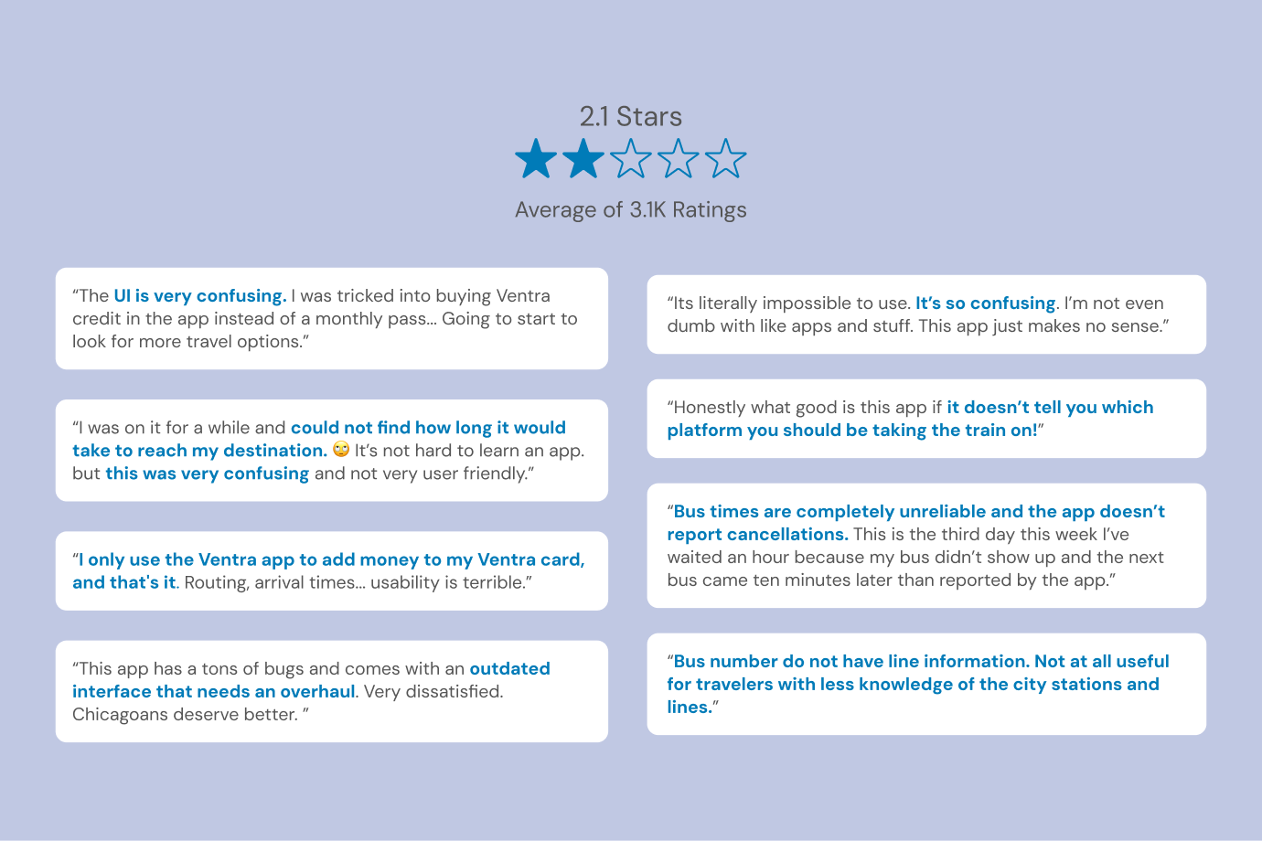
The Ventra app has 3.1K Ratings which average to 1.8 stars. Users generally found the App “confusing”, so I found it very important to increase clarity in my design solutions.
UI Feedback
Some reviews mention important information not being available (e.g line information, platforms). I found that these pieces of information were actually there, albeit not with the best sense of hierarchy which may result in it being lost. Overall, the UI was also deemed ‘outdated’ and in need of a refresh.
UX Feedback
One reviewer identified that the navigation flow had significant opportunity for improvement, as they were unable to figure it out at all. Another user mentioned that they only used the Ventra app to add money to their card.
Solutions
Update the UI
Improve visual hiearchy and add iconography and shape language to distinguish between sections and items. Also, update dated UI aesthetics.
Add Customization Features to the Home Screen
Add automatic and manual customization features to better encourage users to use different features of the app beyond adding balance to their Ventra card.
Better the Navigation Flow
Improve the user journey to navigate to another location. Make the flow less confusing.
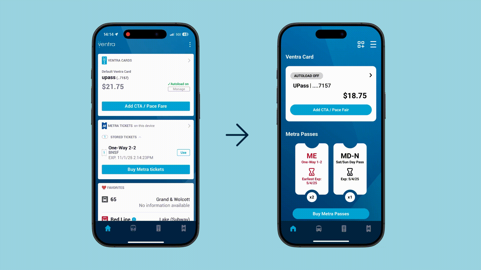
Home Screen
Visual Clarity
Problem
Information is difficult to visually differentiate.
Solution
- Enlarge, diversify, and increase differences between icons.
- Increase sense of hierarchy between different information (text and image).
- Differentiate the Metra pass section further through using the shape of passes.
Customization Features
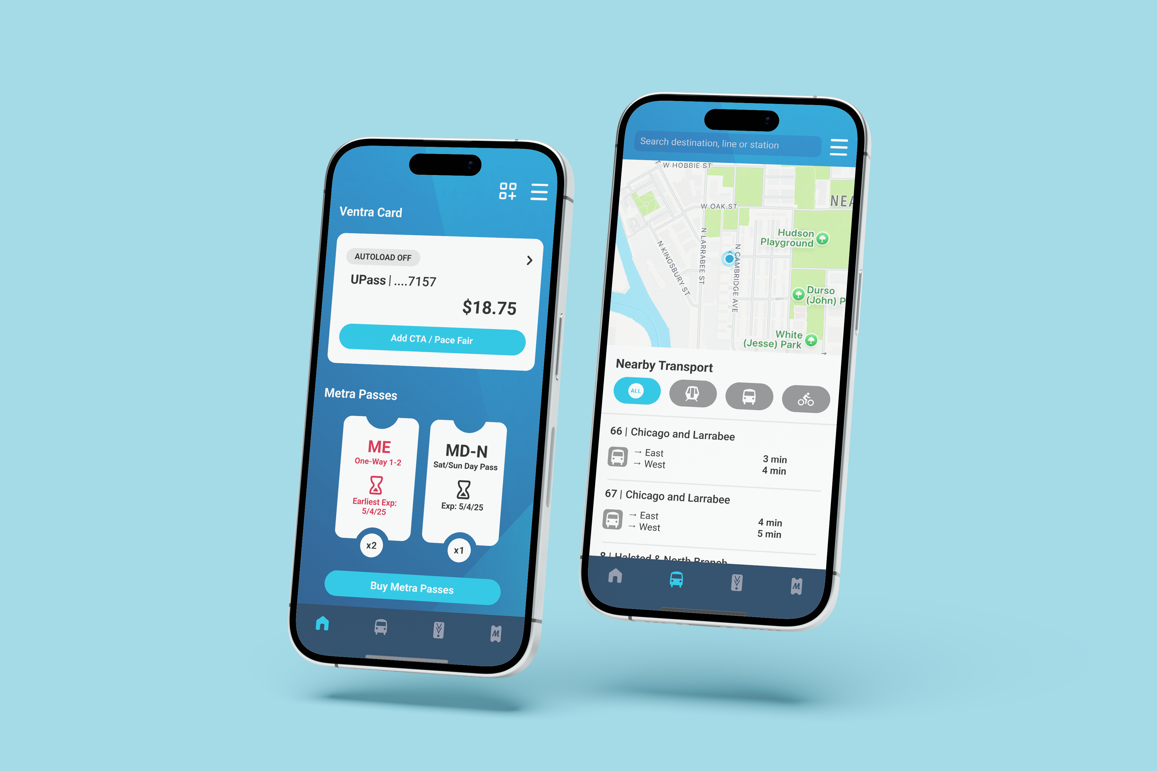
The home screen of the existing Ventra app has a fixed location for all widgets. Because of this, the order of the items shown may not be the most relevant to every user. To counter this, automatic and manual customization features were added.
For the automatic customization features, the Ventra App takes note of what features on the home screen the user is interacting with most. This way, it can show, delete and move the most relevant information to the user to the top of the screen.
Below are two samples of what this could look like on someone’s screen.
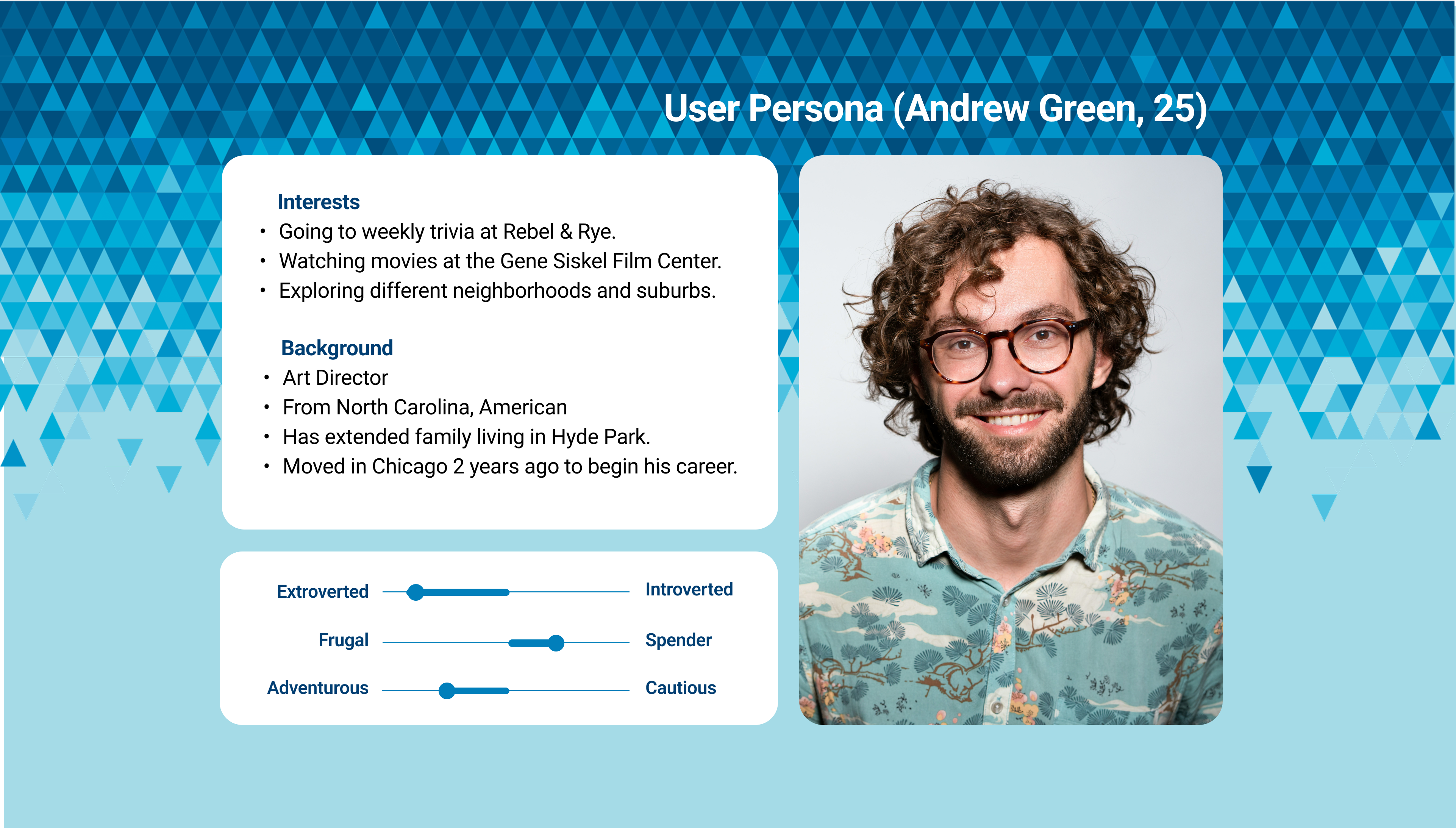
The person on the left is Justin’s, who has newly moved into Chicago and is trying to learn their way to a few specific destinations they go to regularly, including their workplace and home.
Meanwhile, the person on the right is Layla, who is very familiar with the Chicagoland and likes to explore. She goes to different places (including both the city and suburbs) spontaneously.
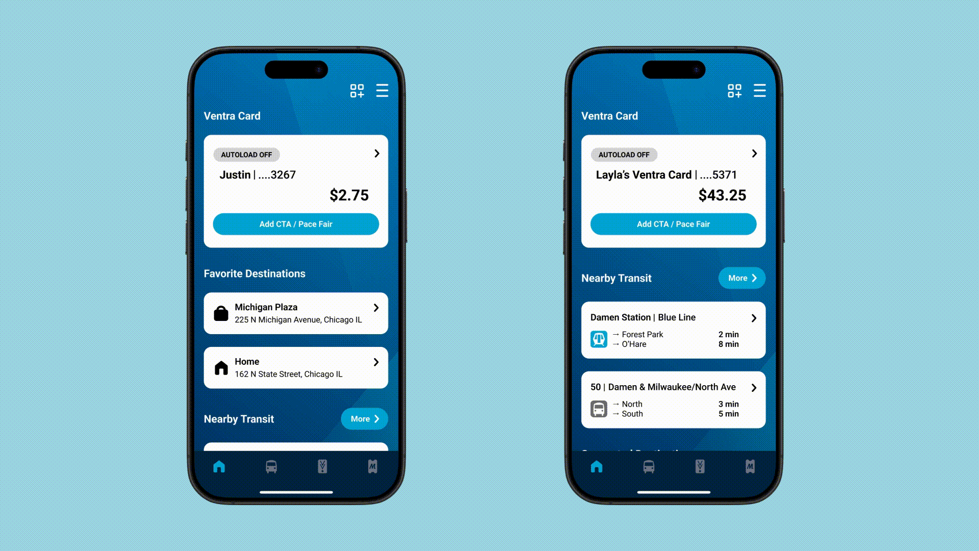
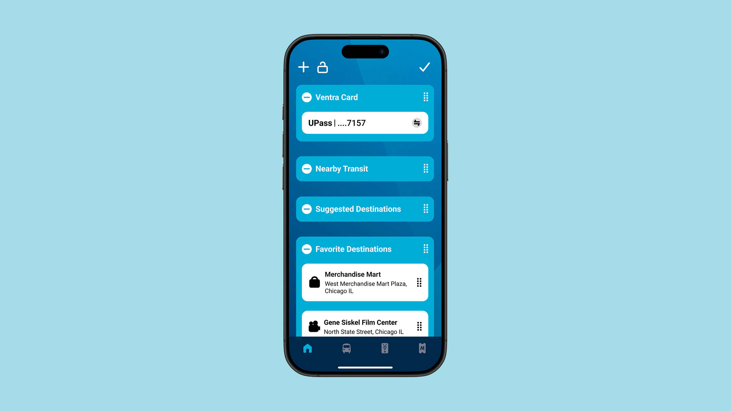
Regarding the manual customization features, there is a ‘edit dashboard’ icon on the upper bar of the home screen. When that is tapped, each item and section can be reordered or removed. Users may add sections, or lock them so their order cannot be changed by the automatic customization feature.
Map Navigation
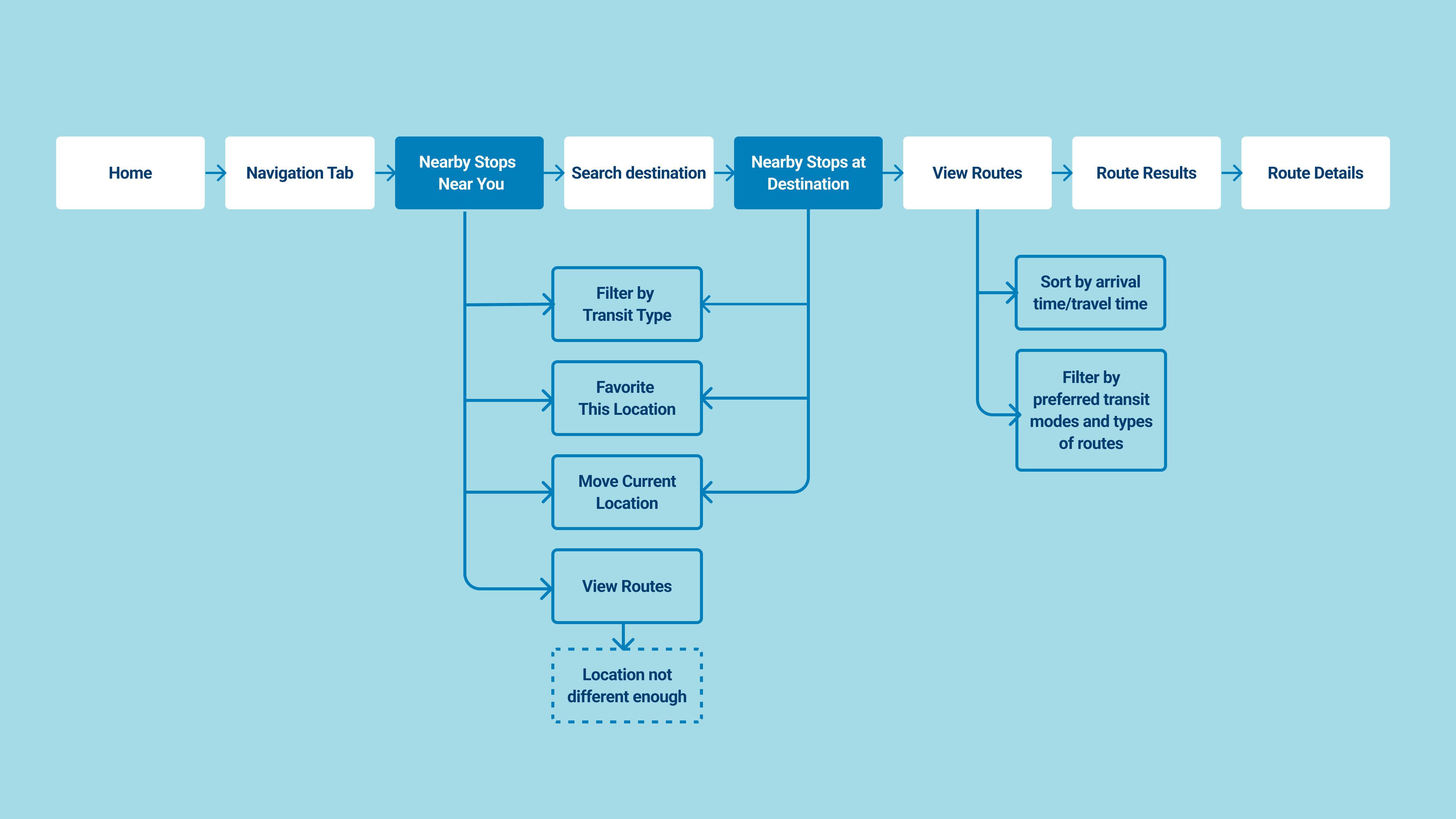
Below is the existing user flow. The two main screens I decided to make major changes to was the "Nearby Stops Near You" and the “Nearby Stops at Destination’ screens. I also made UI changes to the entire interface based on the visual language I established to the Home screen redesign, though minor yet important changes were also made to ‘Route Results’ and the ‘Route Details’ screens.
“Nearby Stops Near You” Screen
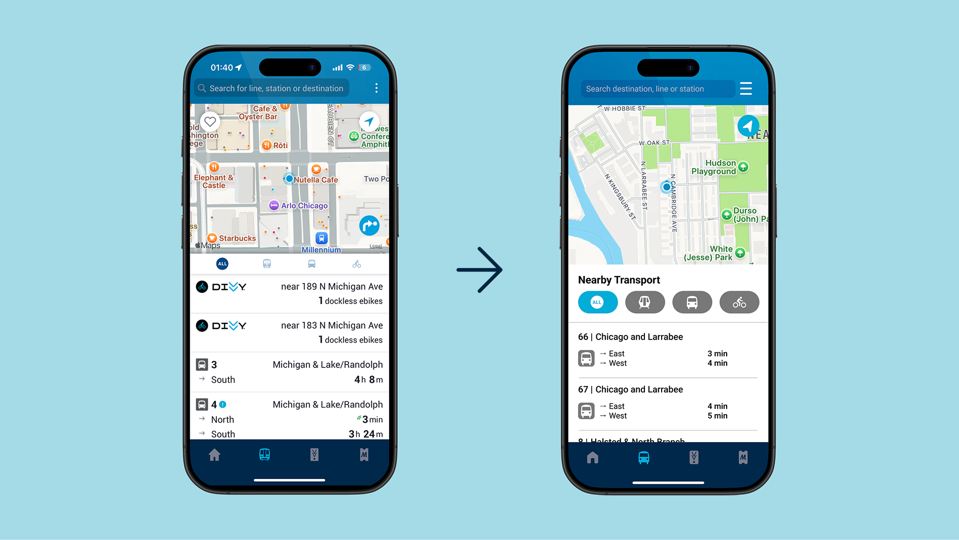
Improving the “Nearby Stops Near You” screen were made through changes that improved clarity, and removing features that users were not engaging with, and so were cluttering the space.
Clarity
- Added “Nearby You” caption, as this is not made immediately clear when tapping the screen, resulting in confusion.
Decrease Clutter
- Removed ability to ‘like’ your current location. It was more likely for users to like a specific address, as opposed to a location that does not have one.
- Removed the “View Routes” button, because when you tap it on the original, it states that the locations are not different enough, and the user can search a destination in the search bar instead, which has a shorter user flow.
I also made changes to the UI for all designs going forward so it would look more cohesive with the redesigned home screen.
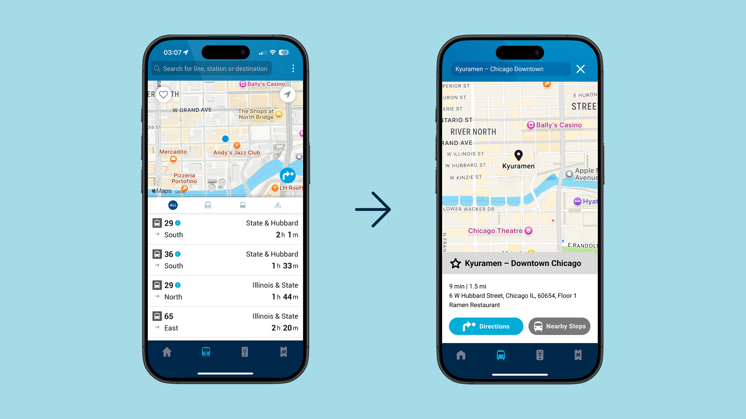
“Nearby Stops of Destination” Screen
This screen was very confusing for users. It could easily be mistaken as the “Nearby Stops Near You” screen, since besides the changed map, it looks exactly the same. Due to this, it also faced similar issues when it came to clarity. So, major changes had been made to differentiate and it from the “Nearby Stops Near You” screen, as well as for clarity.
Differentiation from “Nearby Stops Near You” screen:
- Contain all information in a different tab emerging from the bottom of the screen. Made the top of the tab grey to further differentiate it from the previous “Nearby Stops Near You” page.
- Added the name of the location selected, as well as the address and distance from the user to differentiate it from the previous screen.
Clarity
- Made ‘directions’ button larger and better hierarchy to give it more prominence on the page, as this is the most likely next action for users.
- Contained “stops nearby location” in a button, as it is of slightly less importance than the ‘directions’ button to users.
The ‘Liked’ icon was also changed into a star due to the associated connotations. as it is more likely for users to have ‘important’ locations as opposed to visit ‘liked’ ones.’
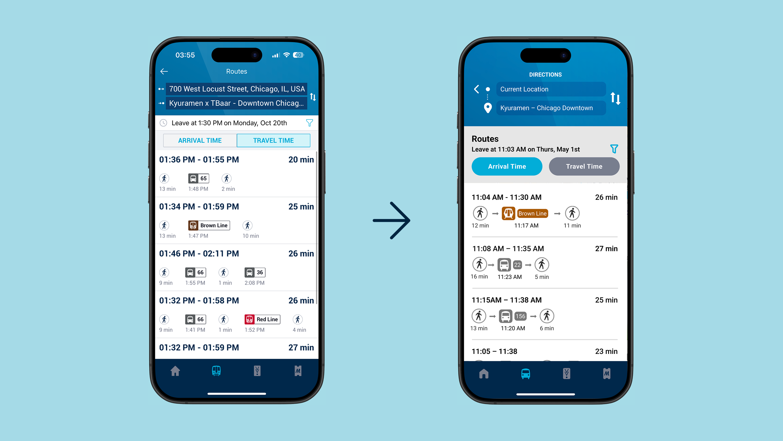
Route Results and Details
"Route Results" Screen
- Added arrows between different kinds of transport to better convey the idea of a route.
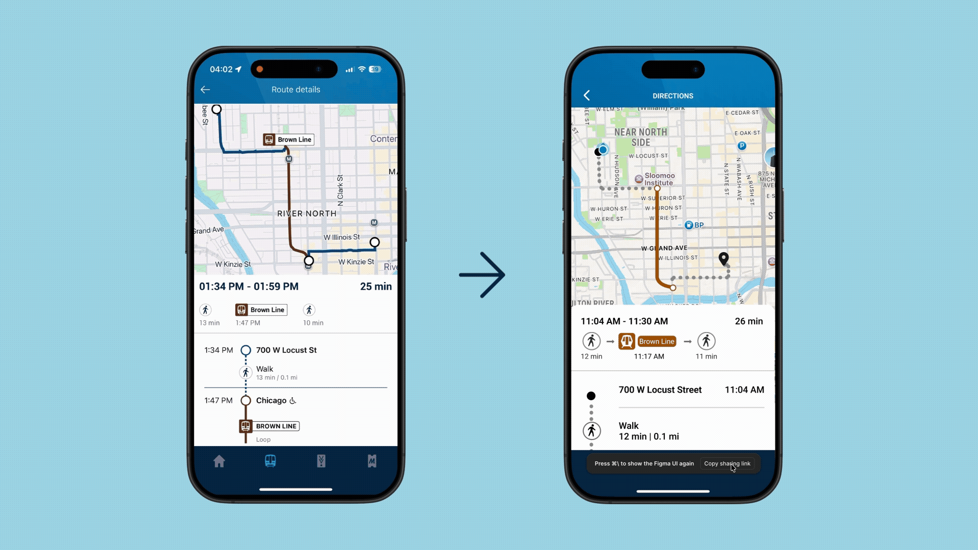
‘Route Details’ Screen:
- Added alternative bus/train times in direction instructions. This prevents the user needing to search directions again for updated transport times.
- Created a visually clearer and ‘streamlined’ visual language by editing lines so they do not intersect and break apart the ‘route’ instructions.
User Journey